Sunday, 15 July 2012

Inky and Messy.

.
Challenge 26 over at Fashionable Stamping Challenges is, 'Lets Get Messy and Inky'. Now how can you refuse an invitation like that, its a crafter's dream.
Please pop over for all the details and see what we have all been making.
I hope you will join us this time, remember we like to see stamping on your projects.

Where to begin to tell you how this evolves. First of all a plain canvas and cream acrylic paint. Followed by a good spray of Dylusions Bubble Gum pink. Some random stamping which appears like smudges now  in the background.
Out with the masks next, I had no idea where this was going, but by now I had hands that looked like they would never be clean again.
Crushed Grape was the next spray I used  closely followed by a lot more pink.
Now shock horror at this as I am not normally a pink person.
I decided to go well girly and used some stamps by Sam Poole for my images, with a bit of paper piecing for the dress, water colour on the wings and she was stamped on news print.
The textured corners are a mixture of embossed Frantage powders.


By now I'd went searching for a frame and found a plastic false wood coloured one that had seen better days and had been pushed to the back of the cupboard.. A few undercoats later, then out with the pink spray again closely followed by a  light spray with the gold mica . I added a bit more embossing powder to  parts of the frame, not a good idea using a heat gun on plastic, but I managed to get a little bit melted and stuck down.
This is another scheduled post.
I thank you all for stopping by, I realy  appreciate your comments .

Saturday, 14 July 2012

Sugar Creek Hollow


We sometimes have to make a card that we all would like not to be making in the first place.
This week the theme of our challenge at Sugar Creek Hollow is 'Sympathy'.
Our sponsor for this week is  Robyn's Fetish, who supplied this beautiful digi of a Lily that I used on my card..
I hope you will pop over for all the details and see what my team mates  have been making. Remember we like to see your projects using a shabby chic/vintage style.
The background layers are white and grey cardstock. The arches are a  die cuts  and the bottom of one of the layers I embossed with swirls. The lily is water coloured and the edges of the white card is shaded with a light touch of pink chalk.

Sorry I haven't been able to visit you all these past few days, this is a scheduled post.
 I hope to be able to catch up soon
.Thank you for stopping by to take a look, your comments are always appreciated.


Monday, 9 July 2012

Work in Progress

Its 'Configurations Time'.
This is most definitely work in progress, the next stage of our journey exploring the techniques in Tim Holtz's  Compendium of Curiosities  Volume 2.
 Linda over at Studio L3 has directed us for Challenges 11 and 12 to pages 33 and 34 of the book.
Mario has given a fantastic prize for this challenge as well.
As you can see, its nowhere near finished, but Linda said this would be okay as its the techniques that are important not the details of what we add. As always we cannot say what we did, just guide you to the pages we used.
The only thing I realy would like to know is  how do you get the tissue tape to stick down?
Mine was not playing ball.
I may not get to visit all my blog friends in the next few days, I look forward to visiting   with you all later.
Thank you for taking time to take a look, your comments are appreciated.

Saturday, 7 July 2012

Summer Days


Summer Days is the new Challenge theme this week over at Sugar Creek Hollow.
 So,  think of summer, flowers, gardens, holidays etc, this is what we would like to see on your project.  Remember we would like you to keep to our Shabby Chic/Vintage style.
Please pop over for all the details and see what we have been making this week.

I decided that after all the rain and awful weather we have been having in the N.E. of England a trip to somewhere a lot warmer would be a great destination.
The background papers are mainly Graphics 45, torn and shaded with Vintage photo distress inks.
A couple of layers were embossed, sorry cannot name the maker of the folders I used.
The lady enjoying cooling her feet in the sea is a Crafty Individuals stamp. { I have been using this a few times recently and she still doesn't have a sun tan, }.
 I used water colours and distress markers to colour the image and the sea, with a bit of glitter to accent the ripples.

I will also be entering ,  C.R.A.F.T. challenge 162  - Splashy/Water themed.

Thank you for stopping by to take a look, I realy appreciate your comments.

Wednesday, 4 July 2012

July

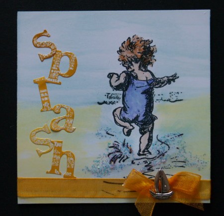
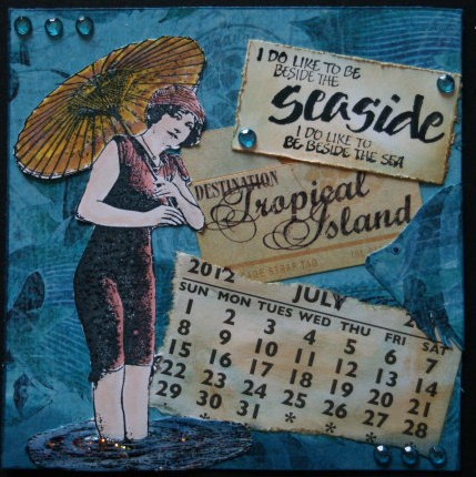
July and another Fat Page [4 x 4 inches ] Calender on its way to my swap friend.


One side  of the page shows this little lady is having a good time at the beach making a 'splash'.
This  image is  one of Joanna Sheene's stamps.
I used watercolours to colour this side and there is glitter  to highlight the water, but it hasn't shown up so well on the photo.


For the other side, I think she has grown up and her idea of a good holiday is going off  to a much more exotic destination.
This image is a Crafty Individuals stamp and sentiment, with Graphics 45 papers featuring tropical fish.
The colouring on this side was done with Distress Markers.


Challenges that I will be entering are-
Artful Times -Oh I do like to be beside the seaside.
Out of a Hat Creations - Challenge 14.  Summertime.

Thank you for stopping by to take a look, I always appreciate your comments.

Tuesday, 3 July 2012

Bingo


This week at Try it on Tuesdays  we are hoping you will join us in a game of Bingo.
To add a twist we would like to see a butterfly somewhere on your project.
Please pop over and see what we have all been making, and get all the details.


For my card, I used the bottom line.-
3 Gems, Lace and Feather. As you can see my main focus is the butterfly.
For once, not a stamp was used, quite unusual for me.
All the papers and extras came from my stash  with some Distress ink, Victorian Velvet for extra shading.

Thank you for stopping by I always appreciate your comments.

Sunday, 1 July 2012

Cinnibar


We are going off  to the  'Orient ', for our new theme at  Fashionable Stamping Challenges.
As always the winner will receive a prize from our sponsor, so please pop over for all the details and see  the fantastic projects  my team mates have been making.  Remember we like to see stamping on your project.

For my visit to the Orient I used a stamp that I have had  for quite a while' Cinnibar'  from Stampington.
I used a metal embossing powder before colouring with watercolours. Layered up with papers, the base card is a bit brighter in real life. All the  extra shading is Peeled Paint distress ink.

Thank you for stopping by, your comments are always appreciated.